We started with an old logo design that never made it off paper until recently. Many of our old sketches and notes are being scanned for digital storage to free up space in the filing cabinet.
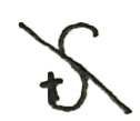
Until recently, we had not worked with Firefly at all, so this seemed like a great opportunity to explore what we could produce out of Adobe’s Generative AI.
We started with a simple prompt and used the image as a structural reference. This was recently introduced in the engine and seemed very interesting. However, for the sake of full transparency, we didn’t start with the above image. Instead we started with these:
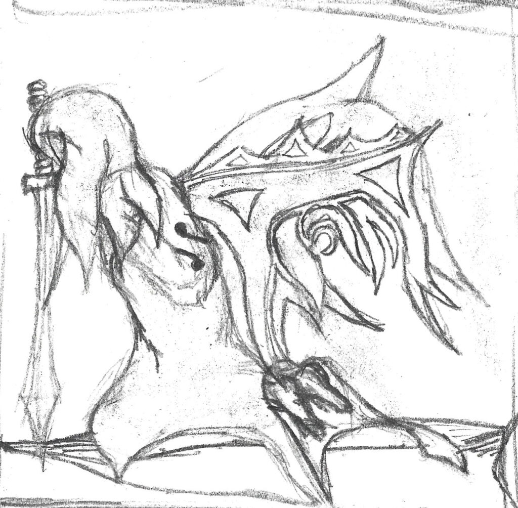
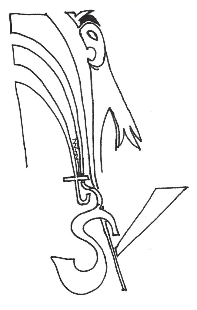
Both of these broke some part of the user agreement or code of conduct… but the language on the “Read More” page didn’t point to anything specific… MAYBE self harm or violence but neither image are actually representations of such… so much for AI.
Anyway, the initial image was mundane enough so that’s what we ended up using for this experiment.
Our first prompt was this:
super detailed flowered text logo
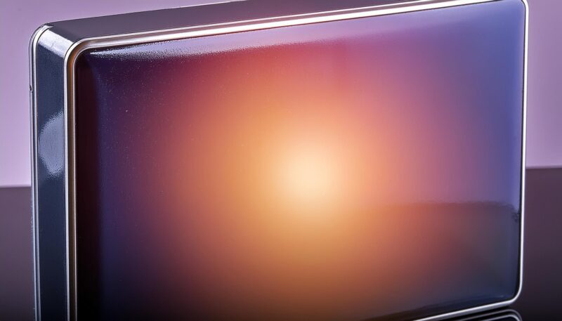
Out of the supplied images, this was the best:
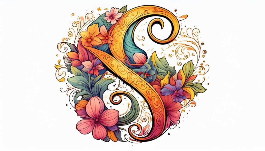
TOO flowery. Let’s change the prompt.
super detailed galaxy text logo
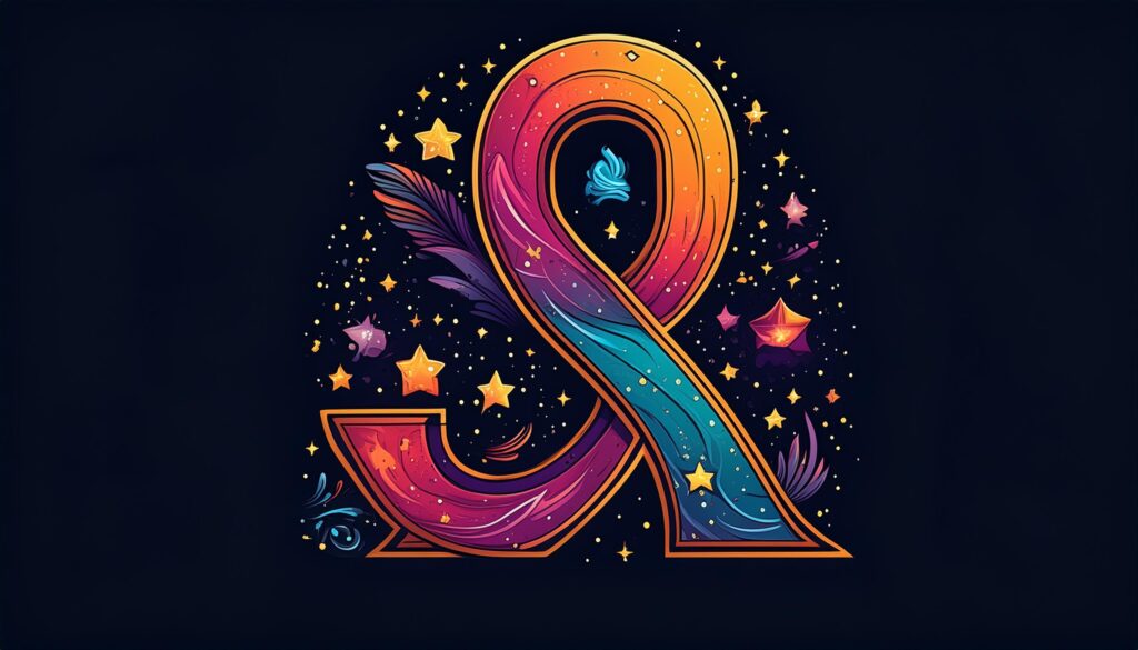
Ok, this is a better direction. But not fully resonating with what we want. Maybe too detailed.
minimalistic galaxy text logo
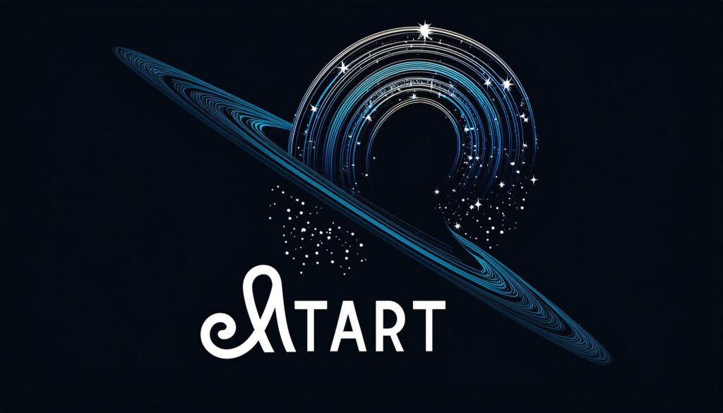
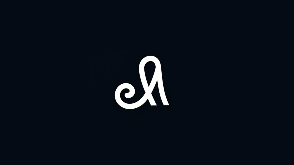
Not really what I want at all… except for that first character in the text. THAT is pretty cool.
Let’s set that aside and see what we can do with the prompt to get a better image. Galaxy isn’t doing much for me.
minimalistic spirit logo
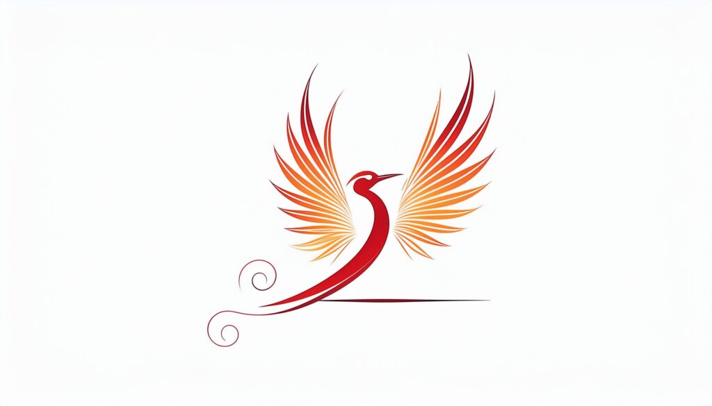
How spirit equals bird is beyond me… but this one at least had the feel of a phoenix which is spiritual in some sense. Let’s find something the engine might recognize.
minimalistic ethereal spirit logo
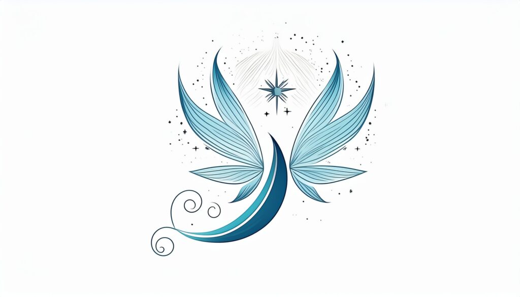
Reiki? Yoga? This isn’t the right direction either. WAY too nice.
minimalistic ethereal demonic spirit logo
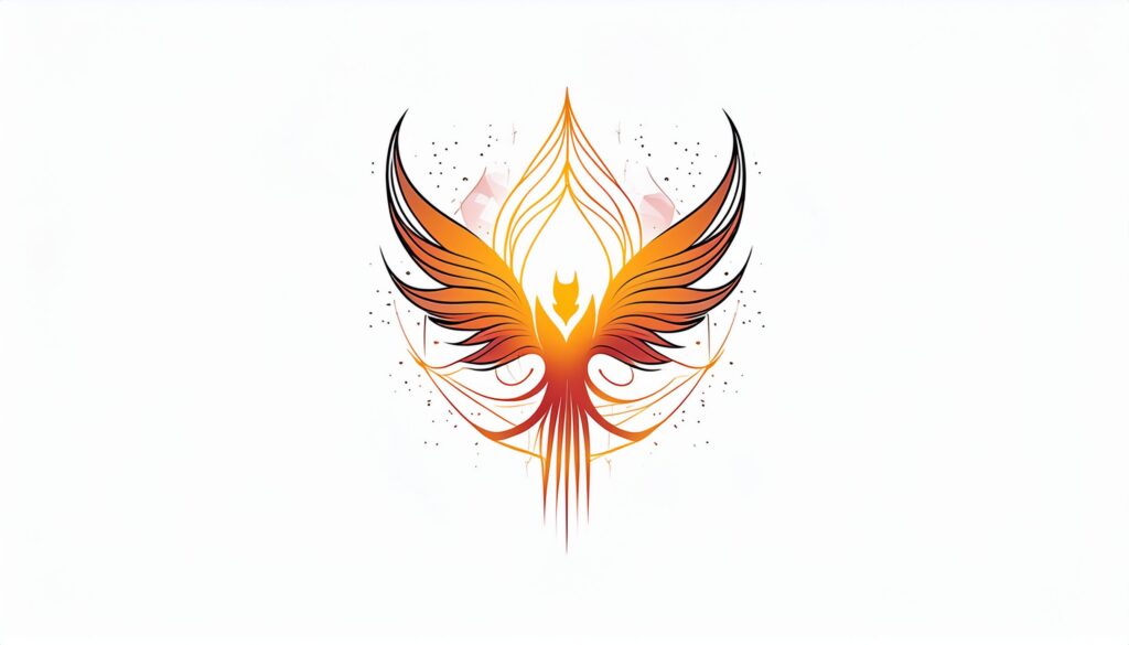
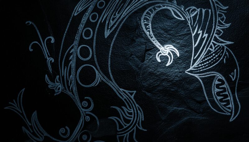
There’s a problem with my images but DEMONIC is allowed???
Right… Kinda neat but feels like it’s getting away from what I was aiming for.
minimalistic ethereal soul logo
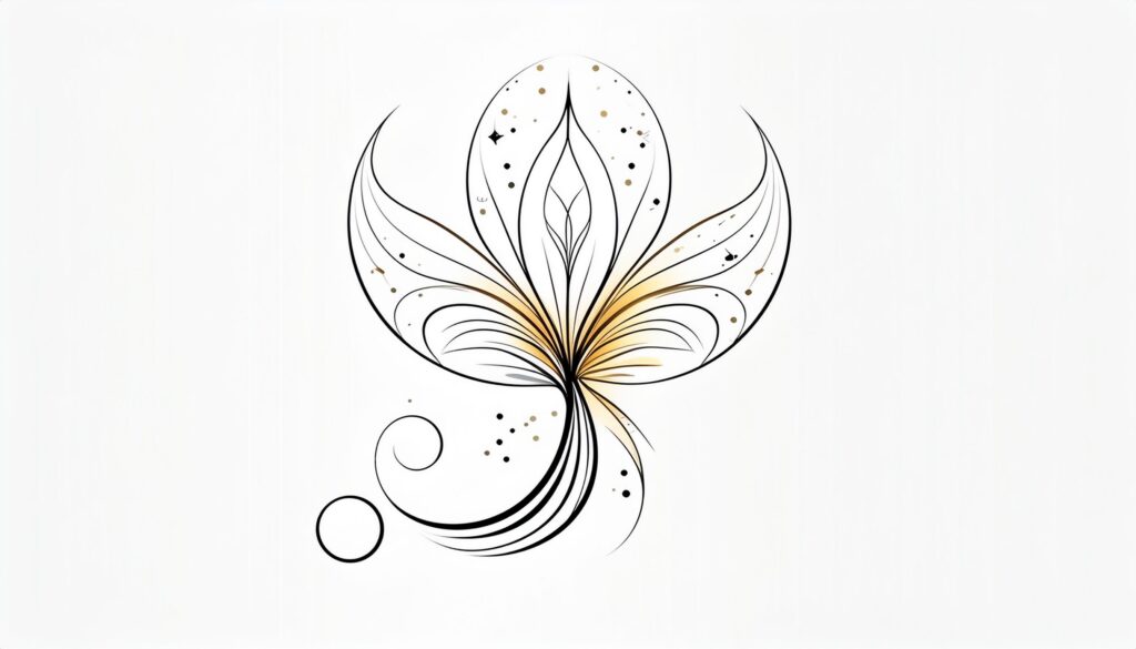
Less of the spiritual guide for sale feeling. Has the essence of the original work… but no.
Maybe splitting up the prompt into segments to emphasize bits as their own might help
very minimalistic; ethereal soul logo
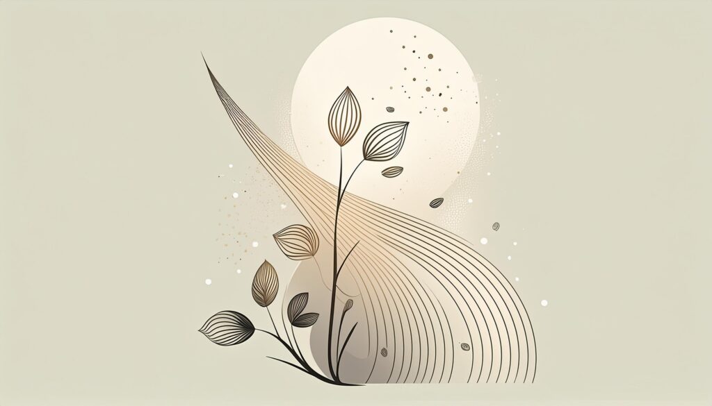
… it’s calm. Good nature influence. The structure from the original logo design is in there… a bit. But maybe today is not the right day to be experimenting in this space.
All in all the best part of this experiment?
This:
