And… we are back.
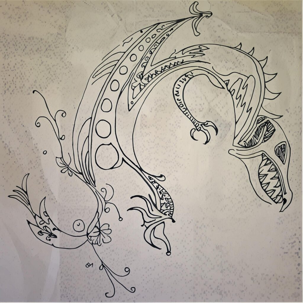
While looking through one of the current notebooks this little design popped up as a reminder that every now and then drawing actually happened.
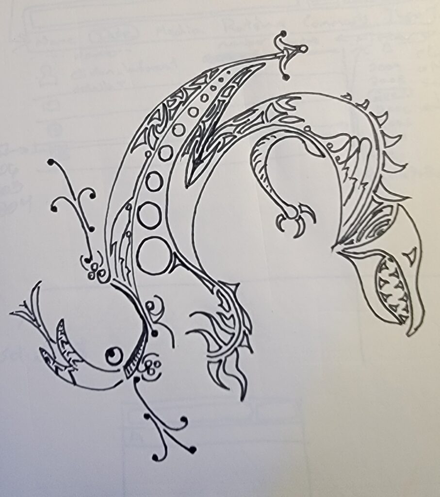
This looks like something that content policies shouldn’t interfere with, so off we go into the depths of Firefly structure reference again!
But first… we need a prompt.
Mayan inspired metamorphosis of lizard into a dragon
That looks good enough. Let’s see what we get with just the prompt
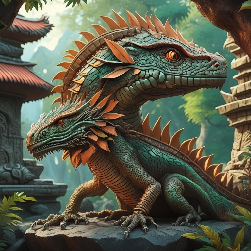
Yeah… that’s pretty much the best starting point we could hope to get. Let’s start integrating the structure reference.
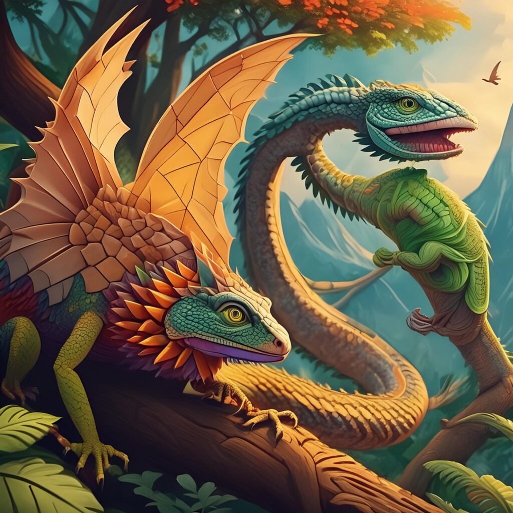
Nope. Let’s turn up the strength of the structure reference.
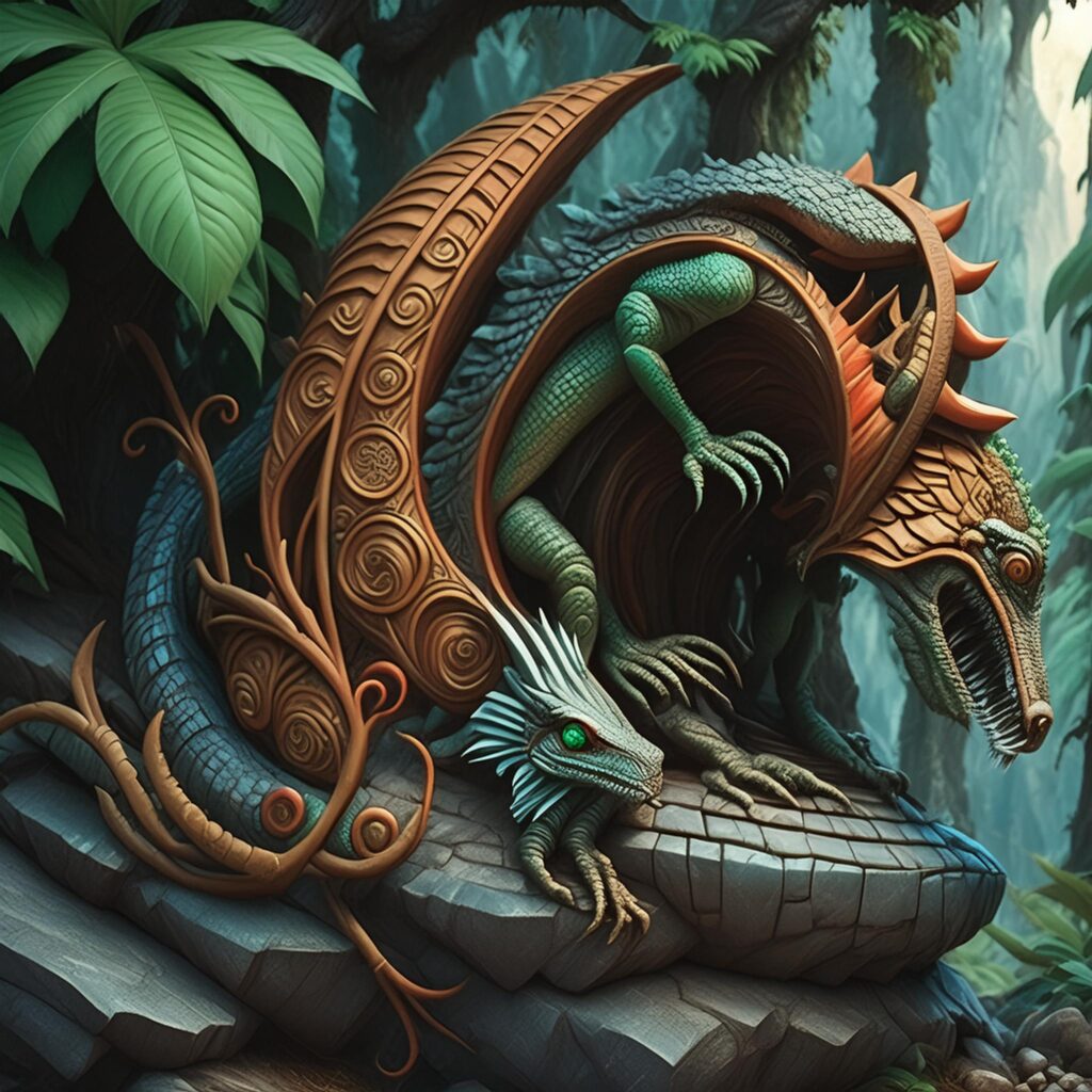
Ok, this is looking better. The inspiration of the original can be seen in there.
Now there are alot of options but the first one that we should employ is this:

This was unselected… now it is set to “Art”. Runtime!
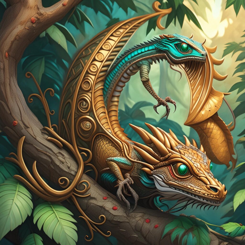
Pretty similar, but there is also this one:
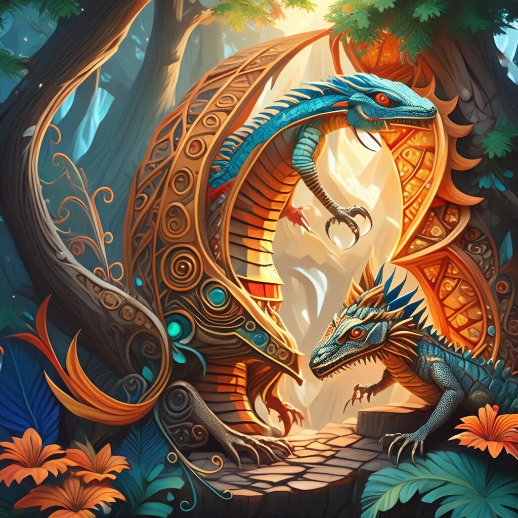
This one definitely strays from the source material in the separate lizard off the the bottom right, but I also see more of the original structure in the flourishes.
Let’s try something a bit fun. Let’s also add the structure reference as the style reference.
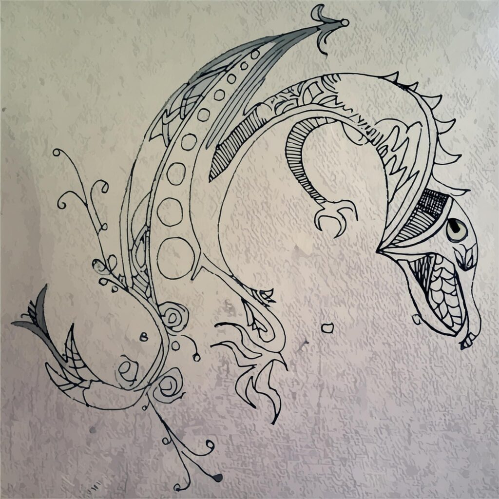
Really all this did was make it look a bit more rough. But let’s take this experiment a bit further and turn down the strength here.
FALL BACK!
After removing the image as a style reference, we need to look at some of the other options. In the hopes of going a bit closer to the reference without all the crazy replacement, a good place to start is selecting “Charcoal” as a “Material” Effect.
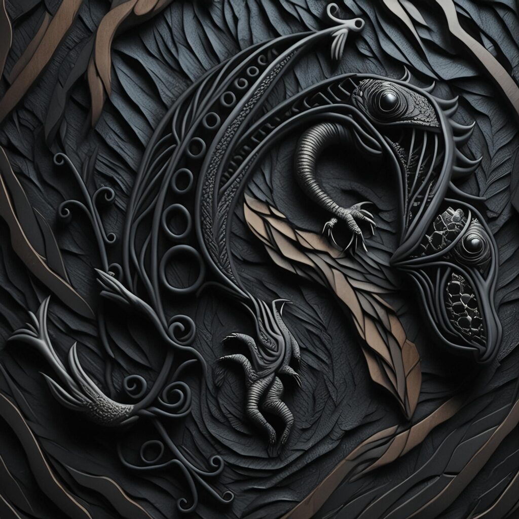
Skyrim vibes!
This might be the go to but we noticed this is on the “Square” setting and it should be on 16:9… for thumbnail purposes
Ok, this one change and regeneration did something really neat.
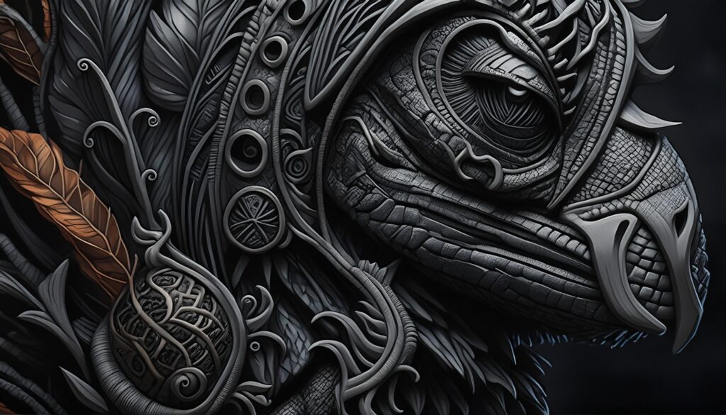
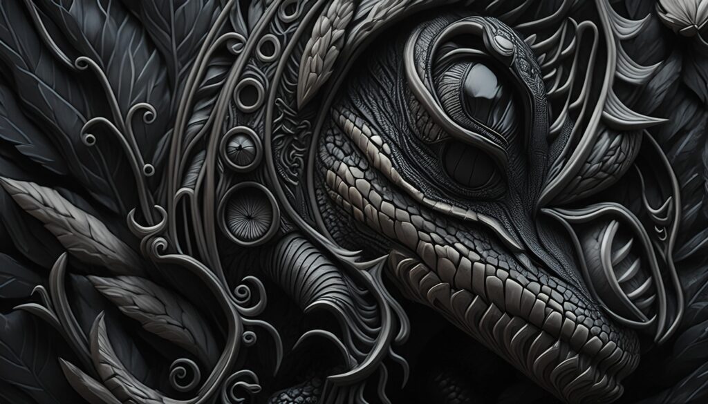
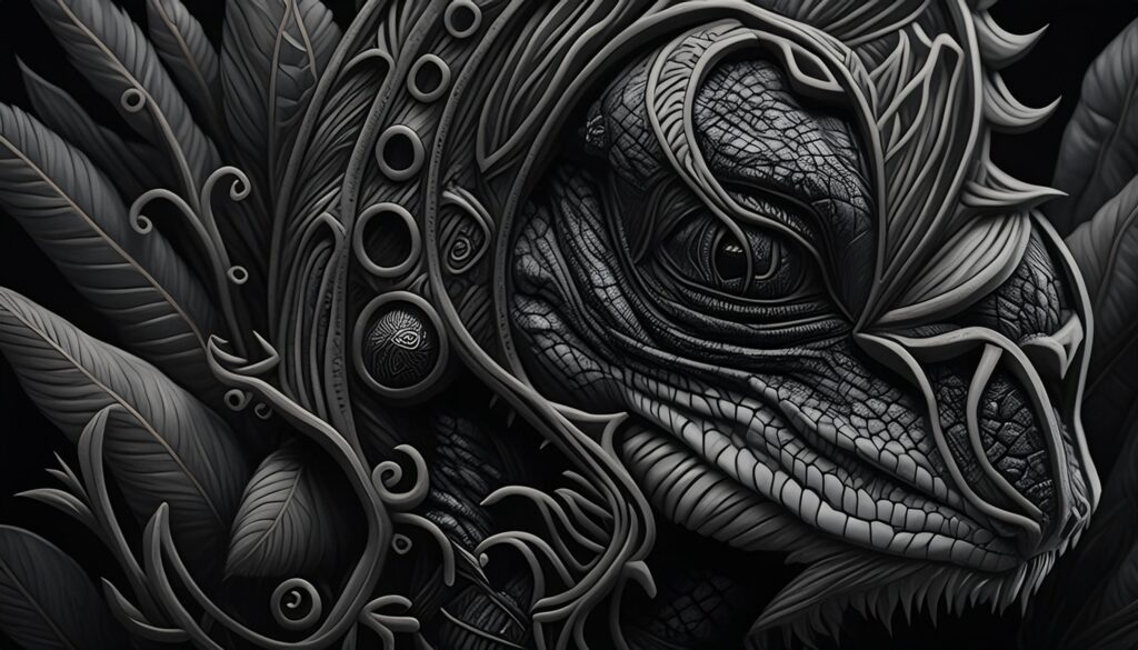
We received lizards in armor (or atleast headdresses) designed using the structure reference. That is actually really cool and wasn’t the original intention of the drawing, which was more along the lines of a rough tattoo design.
While that is crazy neat, we should try a couple more changes. Let’s add on “Light painting” as a technique.
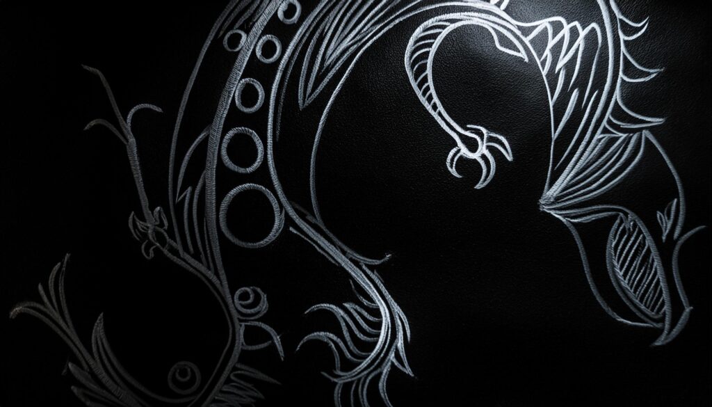
As much as the lizard armor headdress pictures were awesome, coming back to the original design feel nice. Full transparency: there are changes in this image. The actual image isn’t the original drawing… but it is VERY close. But instead of making it more rough, it cleaned up the style.
In fact I grabbed all the versions and generated a few more:
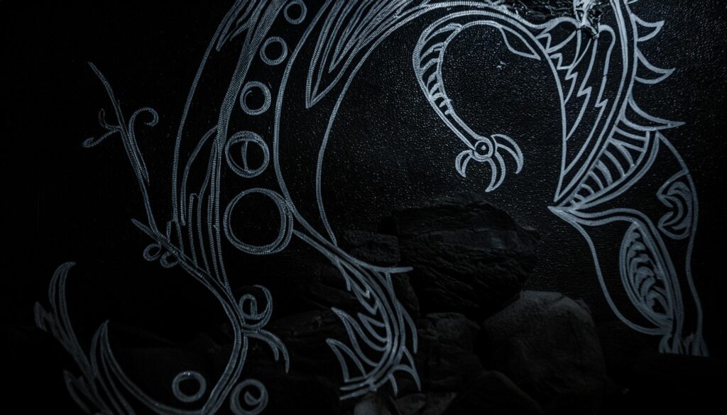
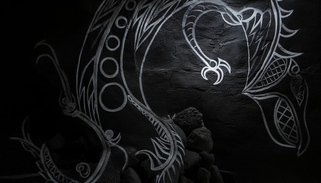
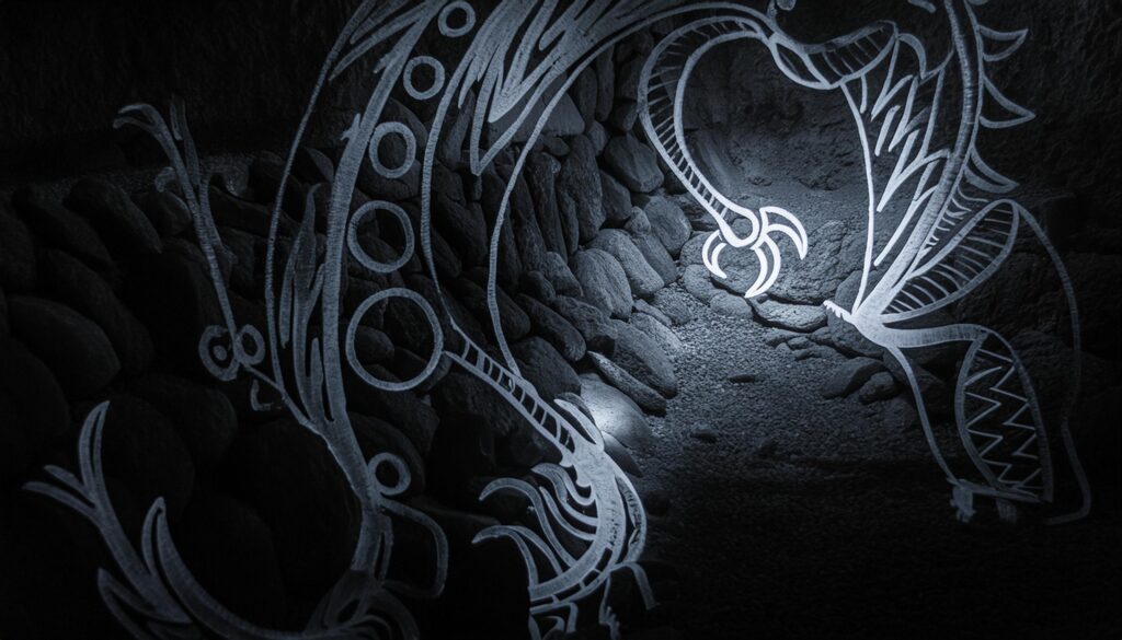
There are a few more… BUT… this one might be the best:
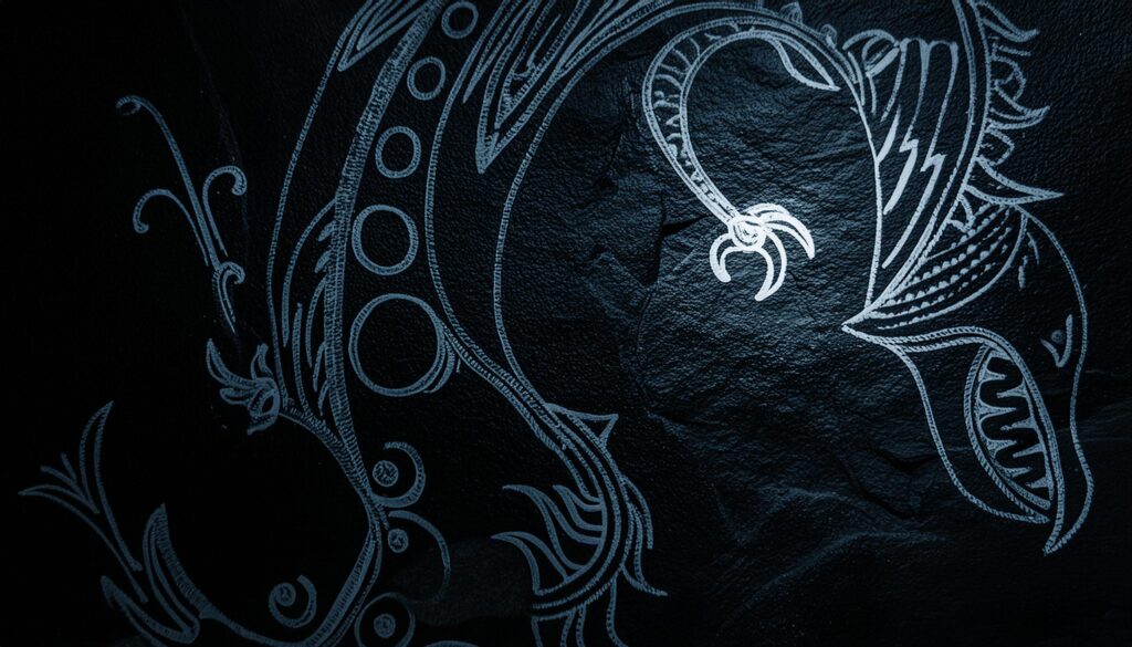
The glow over the hand is great. You can still see the face of the back “lizard”. Finally the original structure is HIGHLY respected here and even keeps alot of the original style.
What are your thoughts?


